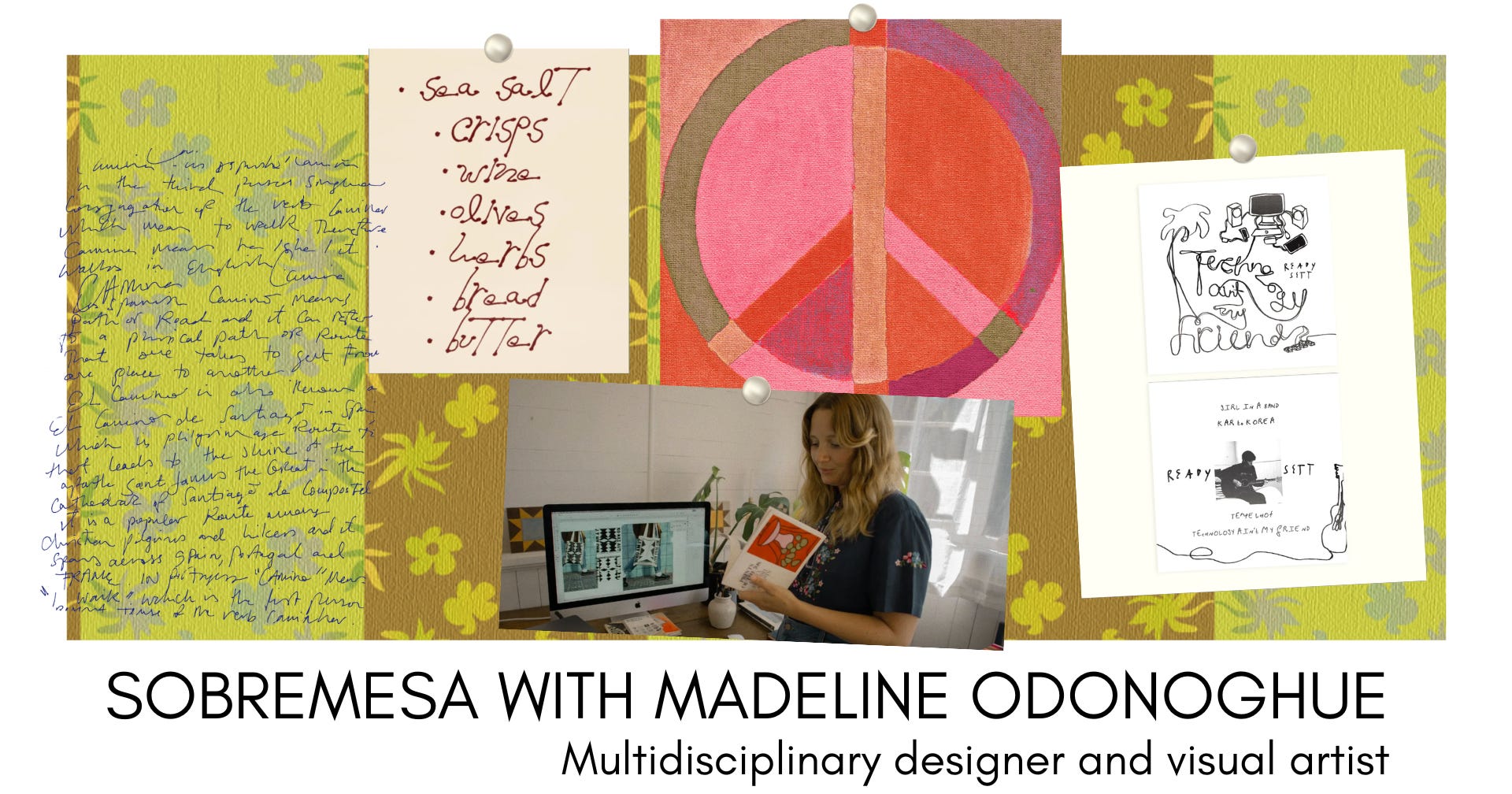
Sobremesa with Madeline Odonoghue
A conversation with the artist behind the internet's favorite typography
Welcome to Sobremesa, an interview series featuring some of the most creative people around the world. Each conversation explores the stories, creative processes, and perspectives that inform the artist’s work.
For this edition of Sobremesa, I am talking with Madeline Odonoghue, the Auckland-based artist behind the typefaces all over our Pinterest feeds. In this conversation, we dive deep into the behind-the-scenes of her creative practice, the inspiration behind her iconic typographic styles, and how she embraces imperfection and analog processes in the era of AI and automation.
Meet the artist 🍧
I’m a multidisciplinary designer & artist currently living and working in Auckland (Tāmaki Makaurau), Aotearoa New Zealand. My work explores language, symbols, and hand-made forms, celebrating imperfection, analogue processes, and ideas that feel rooted in something bigger. I make a range of things, from icon packs and fonts to prints, ceramics, short films, and visual research projects.
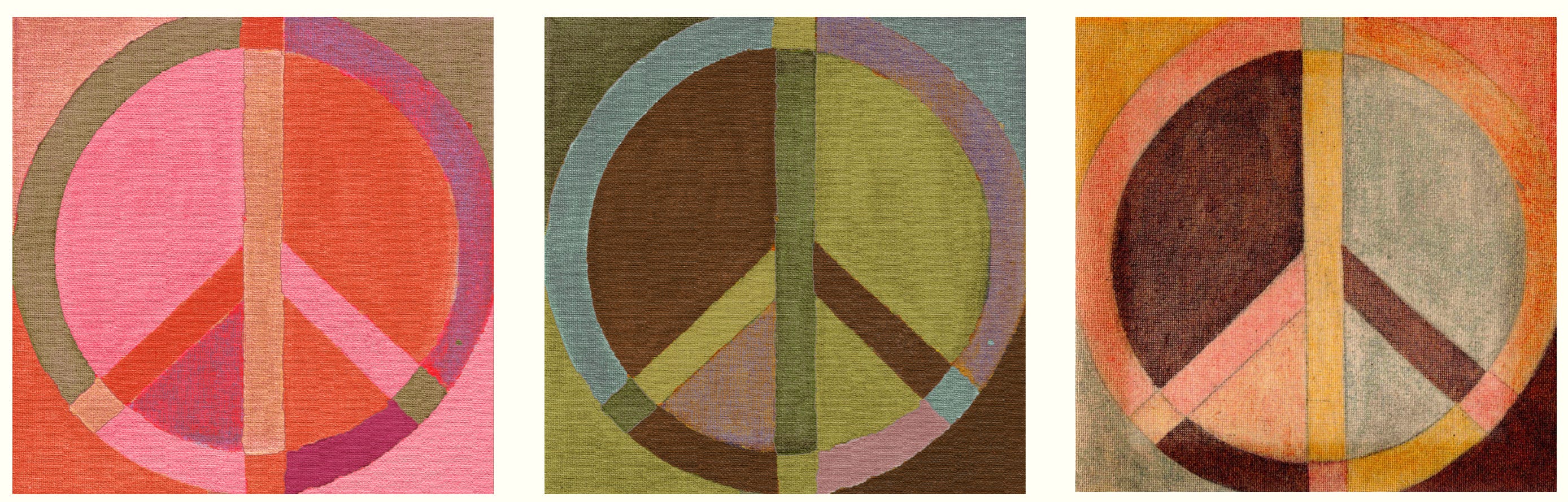
Some key inspirations are Sister Corita Kent, the 1970s, Nina Simone, early Newport Folk Fest, art galleries, Los Angeles, old cars, folk music, protest language, documentaries, quilting as communication, Badlands (1973), architecture, Apartamento magazine, Georgia O’Keeffe, and peace signs. Essentially forms of visual communication that push against or question the systems around us.
For those discovering your work for the first time, could you share a bit more about the work you do?
I have a background in Fine Arts, majoring in painting, but I taught myself design tools while living in Los Angeles (when I wasn’t able to work under a strict partnership visa). Since then, my practice has become a merging of the two, bringing hand-drawn, organic, analogue processes into digital tools and systems, which I try to make available for others to use when possible.
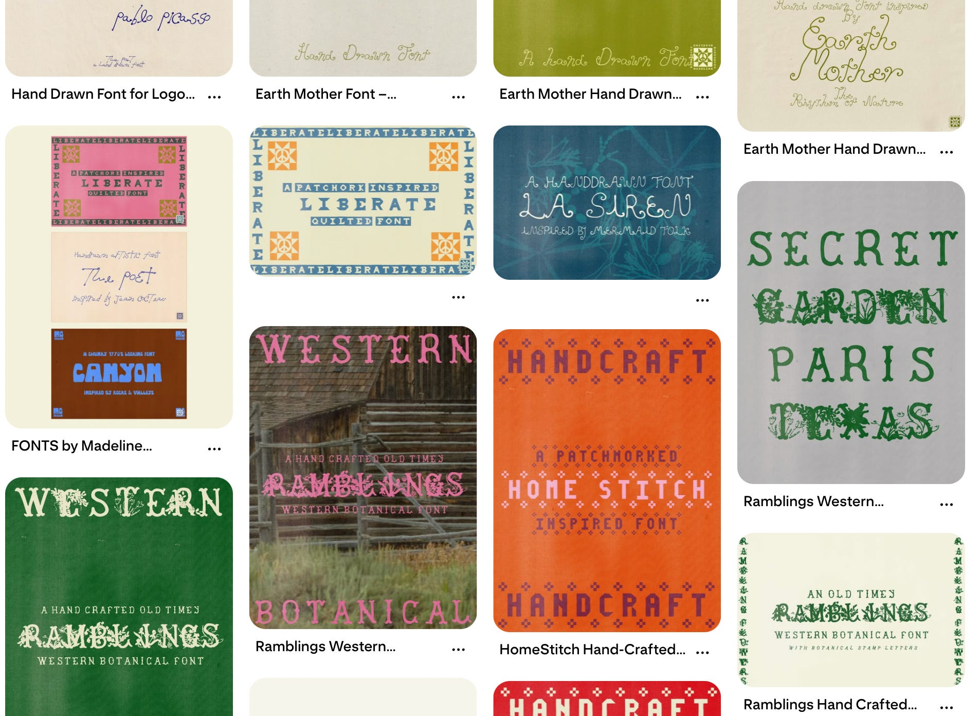
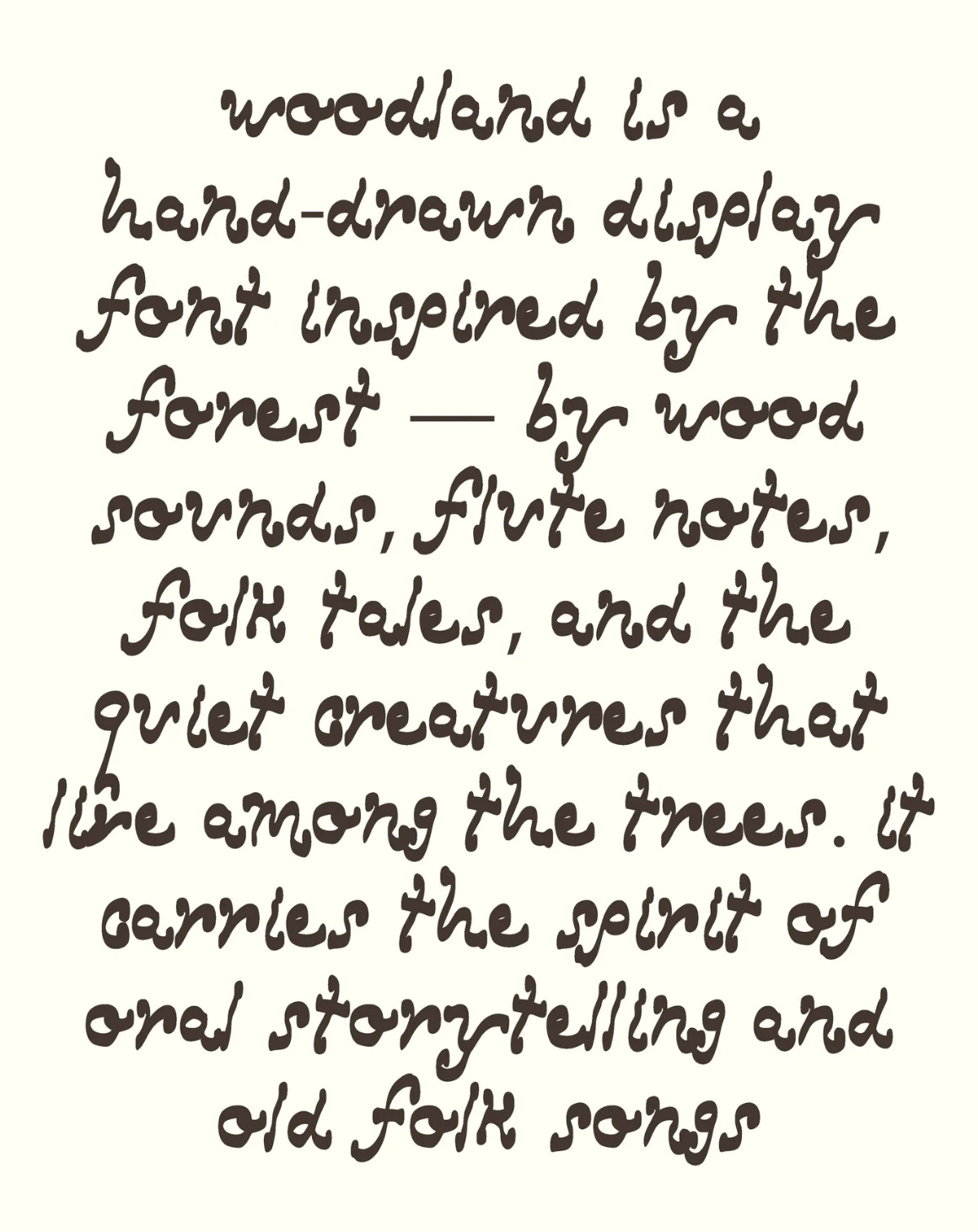
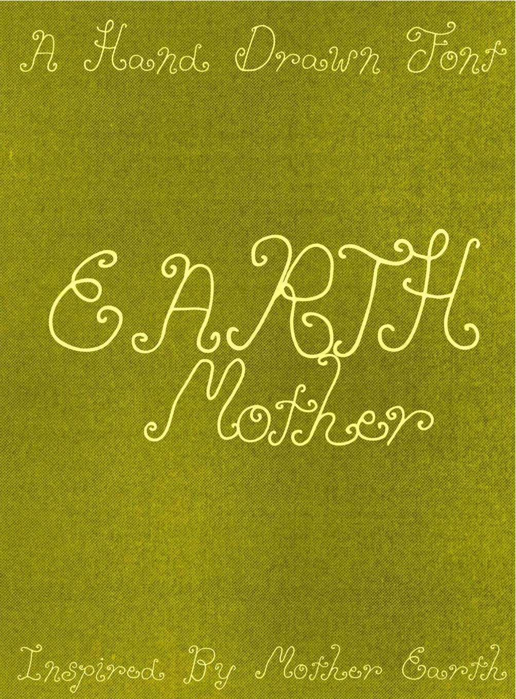
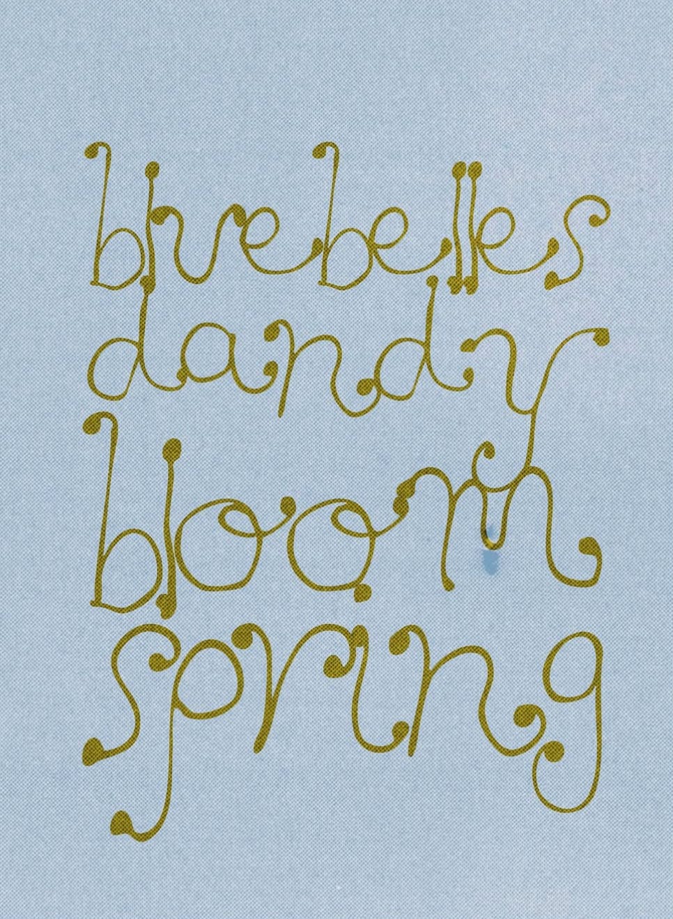
I make quite a range of things. Drawings, songs, icon-based illustrations, downloadable art prints, but lately I’ve been in what I like to call “fontland”: a place where I make hand-drawn, hand-crafted fonts that can be used and reused by others, ideally on meaningful projects.
I came across your typefaces on Pinterest last year and was immediately inspired by them. I was struck by how familiar they felt. There’s a childlike quality to them. I’d love to know a bit more about what inspires your design work, and how you think about balancing playfulness with intention when you’re creating type.
Being in “fontland” gives me a lot of freedom to play with letters, drawing, and communication in a way that feels quite different from anything else. It’s like creating an idea or a feeling that can be used over and over again to communicate visually, so it really taps into my interest in language as visual communication.
There’s always a balance between being playful and conceptual, while also knowing how to systemise that into a usable design tool with the intention of it being used. That said, some of the best work I’ve made has come from moments that are more fluid, hand-drawn, or messy — ideas that didn’t try to fit a particular style, but ended up having the most impact and resonance.
I find that when I try to make something with too much intention, or become too aware of how things “should” work, baselines, structure, all of that, the work can lose its expressive, childlike quality. It loses its naivety, and with that, some of its feeling, so it becomes less successful for me.
‘The more you know, the harder it can be to hold onto true naivety, and naivety is where the freedom sits.’
It’s that idea that the more you know, the harder it can be to hold onto true naivety, and naivety is where the freedom sits. Much like naive music experimentation, rough recordings, where the beauty lies in the mistakes, the rawness, or a crack in a vocal, for me, playfulness is the starting point, and intention comes after.
In an era of AI and automation, I admire how your practice embraces handmade and slow processes. What does imperfection offer to your work that optimization doesn’t?
I struggle with anything too rigid, clean, or overly gridded. That might be because I don’t come from a traditional design background, so instead I tend to look at systems that are in place and slightly mess with them, so that artful thinking can still exist within them.
I still want things to function, a font still needs to work as a tool, but I want there to be an element of the hand, something human, embedded within it.
A good friend once told me I’m subversive, which is something I think about. I’m far more driven by intuition and feeling than I am by technical perfection. For me, imperfection is where authenticity sits.
Alongside your own practice, you work as an arts educator. Is there something that your students have taught you about creativity that you didn’t expect?
I have worked in arts education and it’s something I care deeply about. While I’m doing slightly less of it at the moment, it’s something I intend to move back into, it gives back tenfold. My students have ranged from 3 years old through to university level, and across all ages I’ve learnt something about creativity.
It would be easy to say that children teach you to think like a child again, to have imagination, to tap into naivety, to not feel afraid to talk about art. That’s true, but for me it goes further than that. What I’ve come to understand is that whatever someone sees, feels, questions, ignores, reaches for, or even rejects is entirely authentic to them in that moment. Whether they choose to make something or not, whether they engage or disengage — it is all a form of response. And that response matters.
I think we often expect communication to look a certain way, but I’ve learned that it rarely does. Everyone is communicating, even in silence, even in refusal. Choosing not to engage is still a position, still a gesture, still something being expressed. For me, that’s where creativity sits, not just in what is made, but in how we respond, how we notice, how we position ourselves in relation to something.
Communication and creativity don’t sit separately, they move alongside each other, shaping and informing one another in ways that aren’t always visible but are always present.
When you hit a creative block, what practices or rituals help you reset? Any specific materials or mediums?
To be honest, I don’t hit creative block that often at the moment. If anything, I have a constant stream of ideas and things I want to learn, and I can’t quite keep up with my own brain or the time I have available.
I think that comes from a drive to stay close to that feeling of early experimentation or naivety, which really resonates with me. It gives me a kind of momentum, so I probably avoid creative block by always finding something new to explore.
I don’t enjoy doing the same thing over and over. I get bored quite easily and tend to move on from things, which has its own downsides, but it keeps things active.
That said, it hasn’t always been like this. I’ve definitely experienced creative block, especially with music, which I used to really enjoy experimenting with.
Things that helped me were The Artist’s Way by Julia Cameron, and simple rituals like early morning candlelight and free writing. Especially in winter, there’s something really special about having that quiet, cosy time before anyone else wakes.
Thrifting: My partner and I spend most Saturdays looking through old things. I’m especially drawn to print ephemera: books (quilting, craft, kids’ books, alphabet books), postcards, and photographs.
Gardening: Growing flowers has been such a nice way to step away from the computer and actually see things change in space. Once again, a bit of naivety makes the most imperfect wildflower settings. Playfulness before intention.
Roadtrips: We’re big nature lovers, so we’ll literally drive to faraway places just to see something new. A rock face, a landscape, somewhere that feels a bit magical.
Living artfully: We recently got a screen print kit, so we’ve been experimenting with little one-off tees. I’m interested in shibori and will start exploring that, and my partner enjoys making small but beautiful ceramics, so really, we just like living artfully. We just explore what we want to explore, without everything needing to become “sellable”.
Here are a few websites I dabble in often;
B Jones Style on YouTube when I need some thrifting content
I have only just watched Breaking Bad….
Other offline sources of inspiration:
Apartamento Magazines, always. These are my absolute favorites to receive from my mum and have an hour or so to shut the world out and enter someone else’s authentically captured world.
I have Patti Smith’s new book, Bread of Angels, which I need to start reading
Yates Garden Guide 1970’s New Zealand edition for an evening flick through
Op-shop Quilting / Fibre Arts / Craft books
Thanks so much to Madeline for her time and generosity in answering all the questions for this interview! Explore more of the artist's work on her website.
If you interview inspired you, leave a comment, share it with a friend, or consider upgrading to a paid subscription.
Email me at florenciaornelas.f@gmail.com if you are interested in collaborating or follow along on the other app. Talk to you soon!


